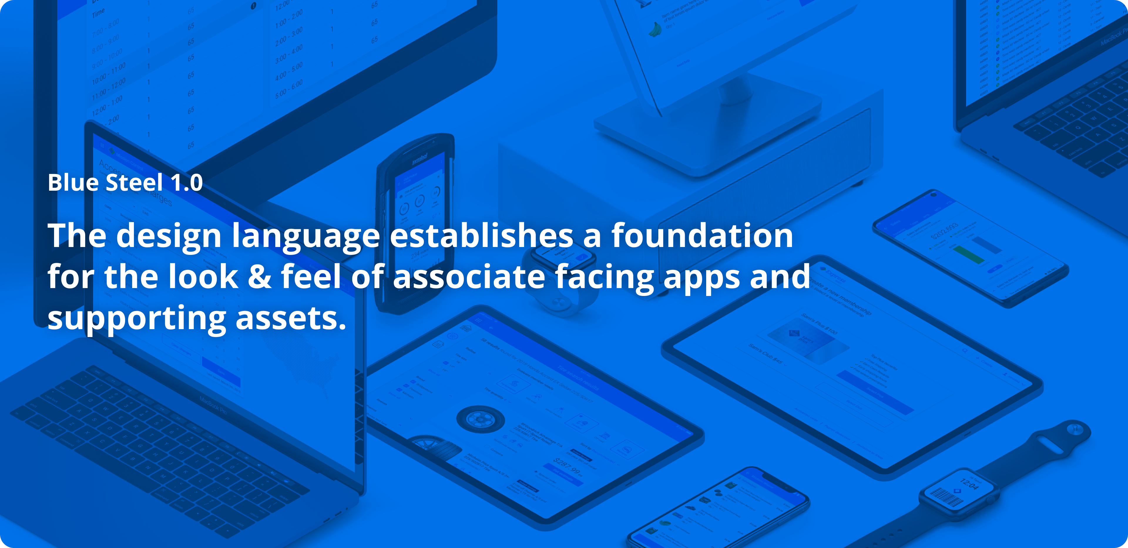
UI Design Guidelines
Project Details
Tool: Sketch, Figma
Date: 2020 - Present
Category: UX / UI, System framework
Company Sam's Club
Blue Steel is the name of the design guidelines of the Sam's Club UX team. We start developing it with associate-facing products and extended it later to both associate and customer-facing products too.
My roleWork with a design agency vendor to develop the design guidelines. Later applying it to all the projects. Mainly contributing to the design of mobile app icons, ideogram,s and components like chatbot UI.
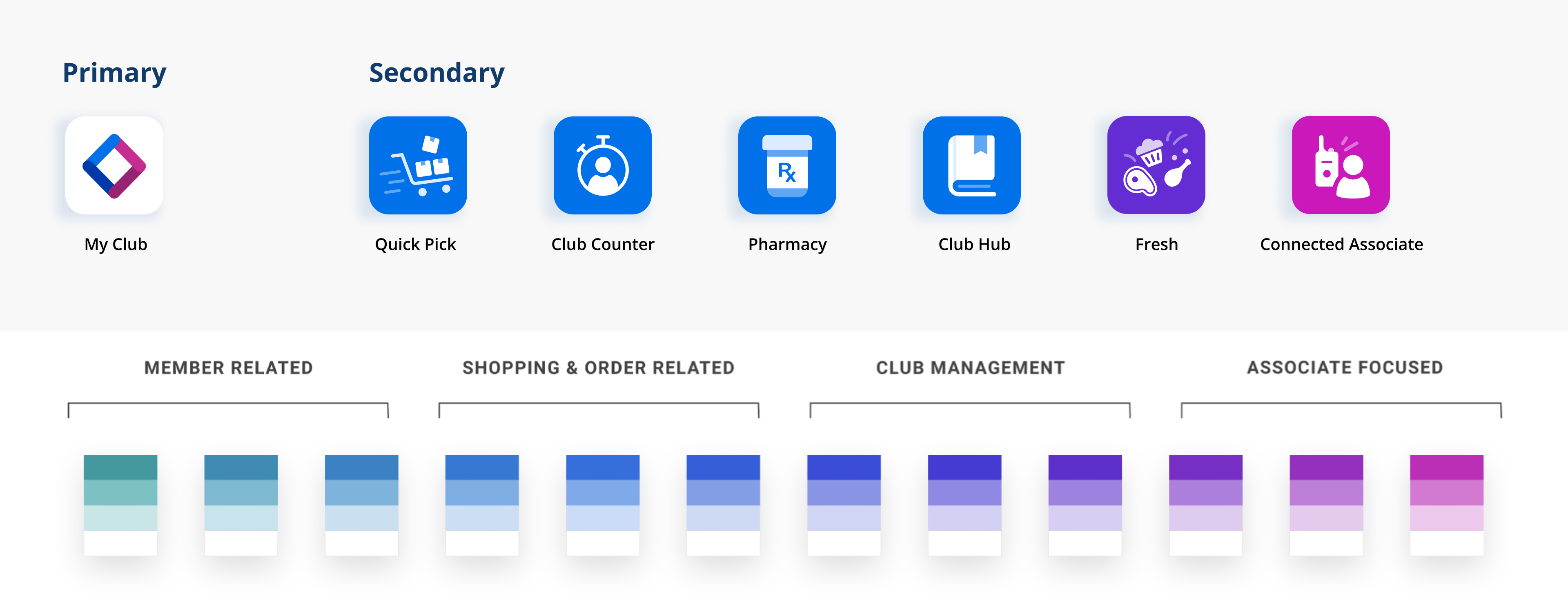
App Icon
Primary & Secondary"Two distinct styles of app icons have been established within the associate experience design language system. The primary-or parent-app example shown here is the My Club application. The secondary app styles pertain to apps that have integration with the "parent" like Club Pickup, Fresh, Pharmacy...etc."
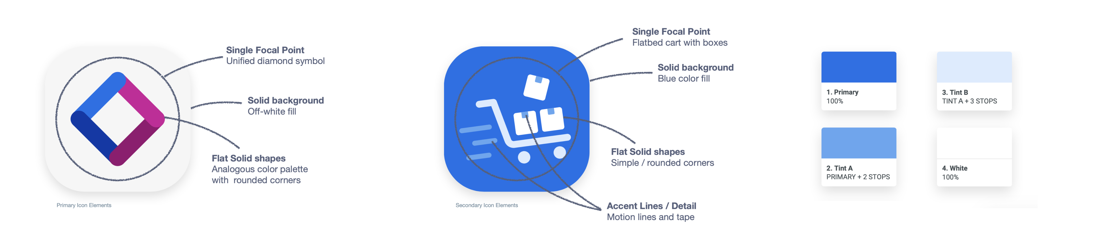
"The best metaphors are demonstrative of some unique function or attribute of the app. In this case, the diamond communicates the role of unification within one app. Other primary apps could encapsulate dedicated or standalone functions like processing returns or signing up / renewing memberships."
Secondary Icon"The best metaphors are somehow demonstrative of the unique functionality of the app. For example, The Quick Pick app icon, the cart communicates the role of speed associate with Club Pickup metrics. Metaphors often don't need to be literal to be effective but the more simple they are the better."
- Sam's Club design guidelines
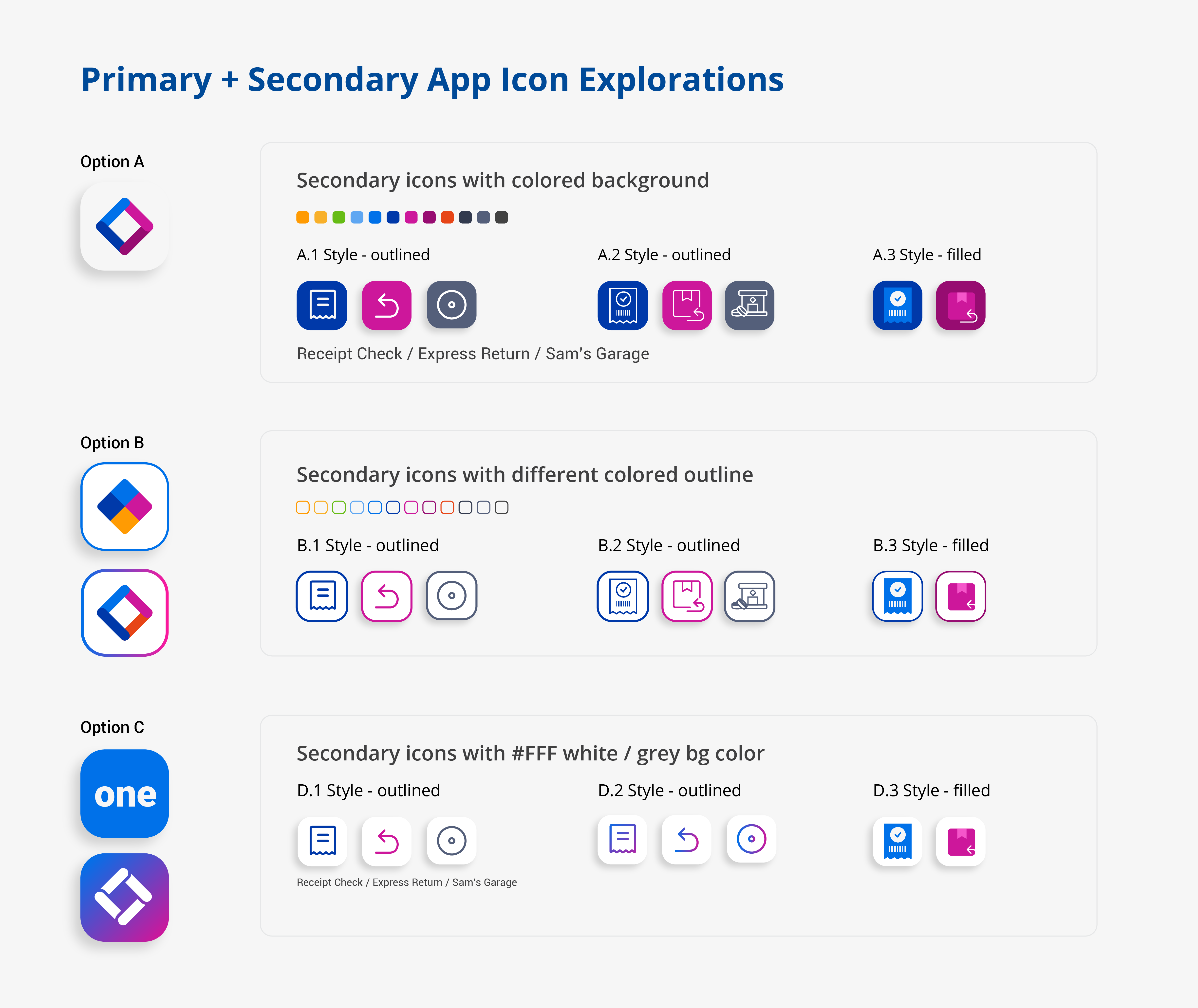
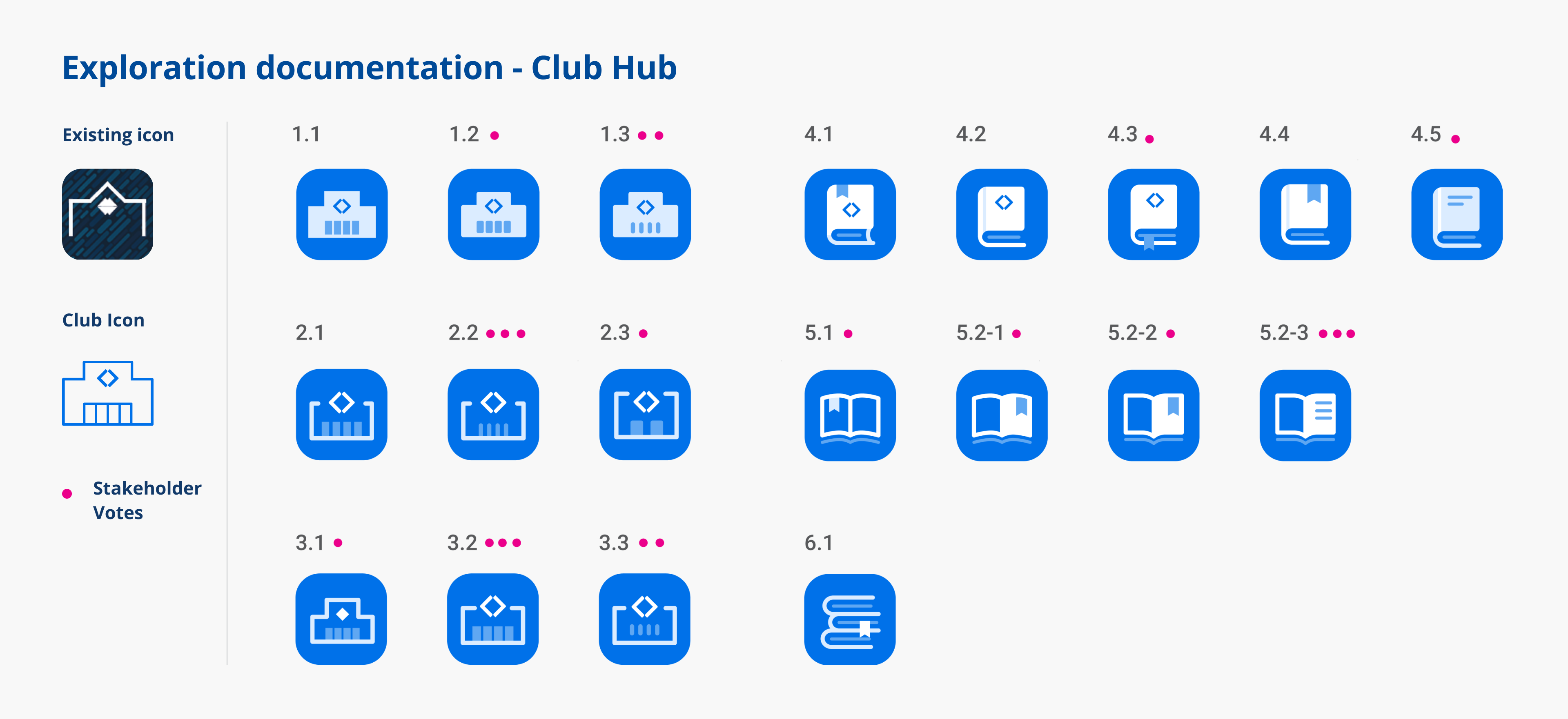
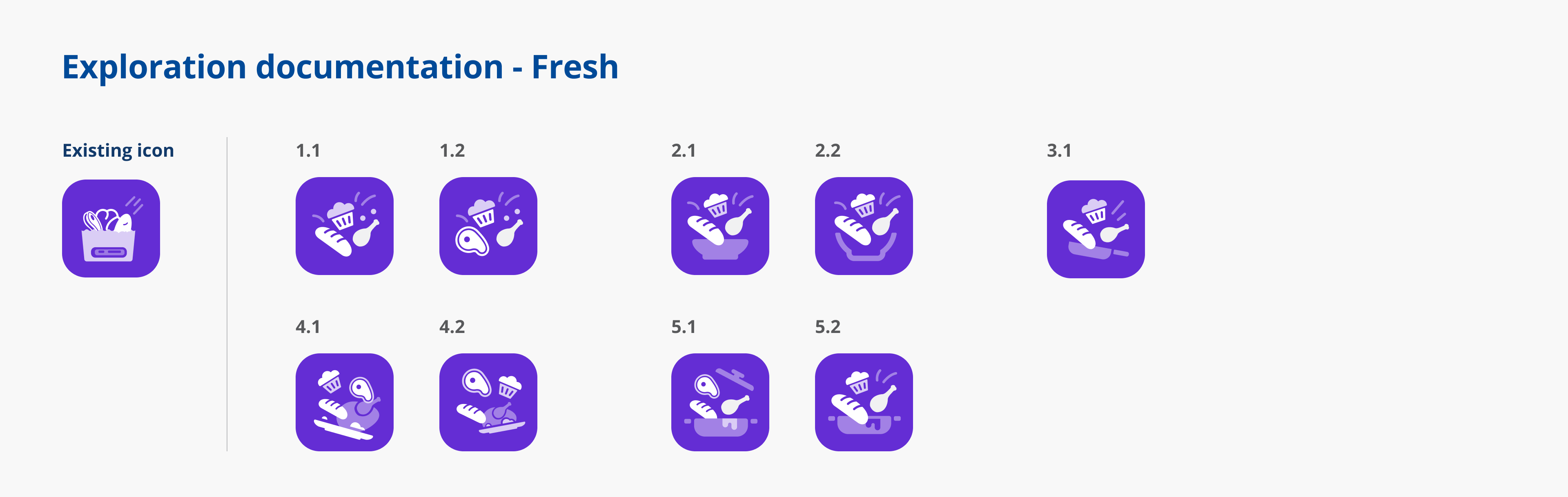
Design icons based on existing designs and stakeholders' feedbacks. Explore icons with different directions to present the concept of the product. Below shows few exploration documentations:
Ideogram
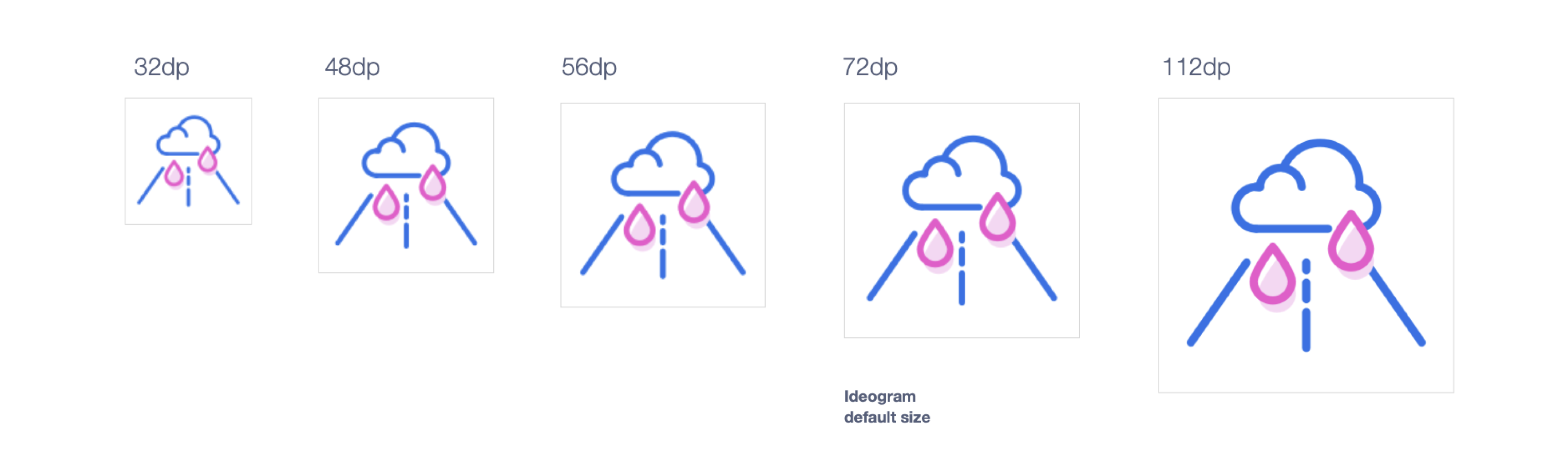
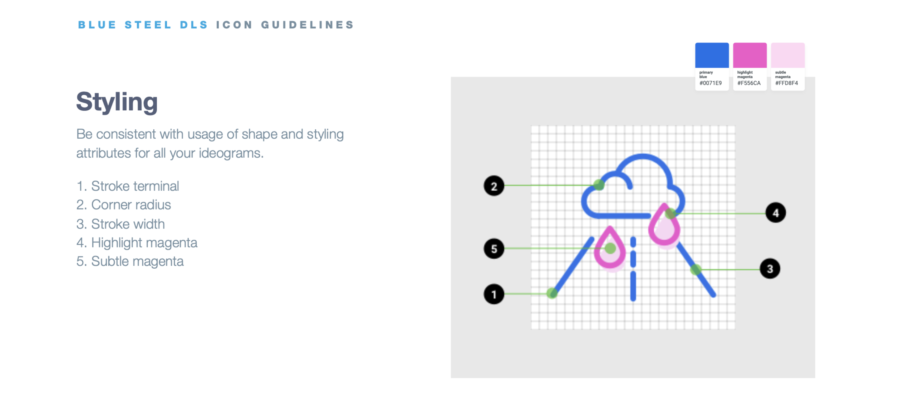
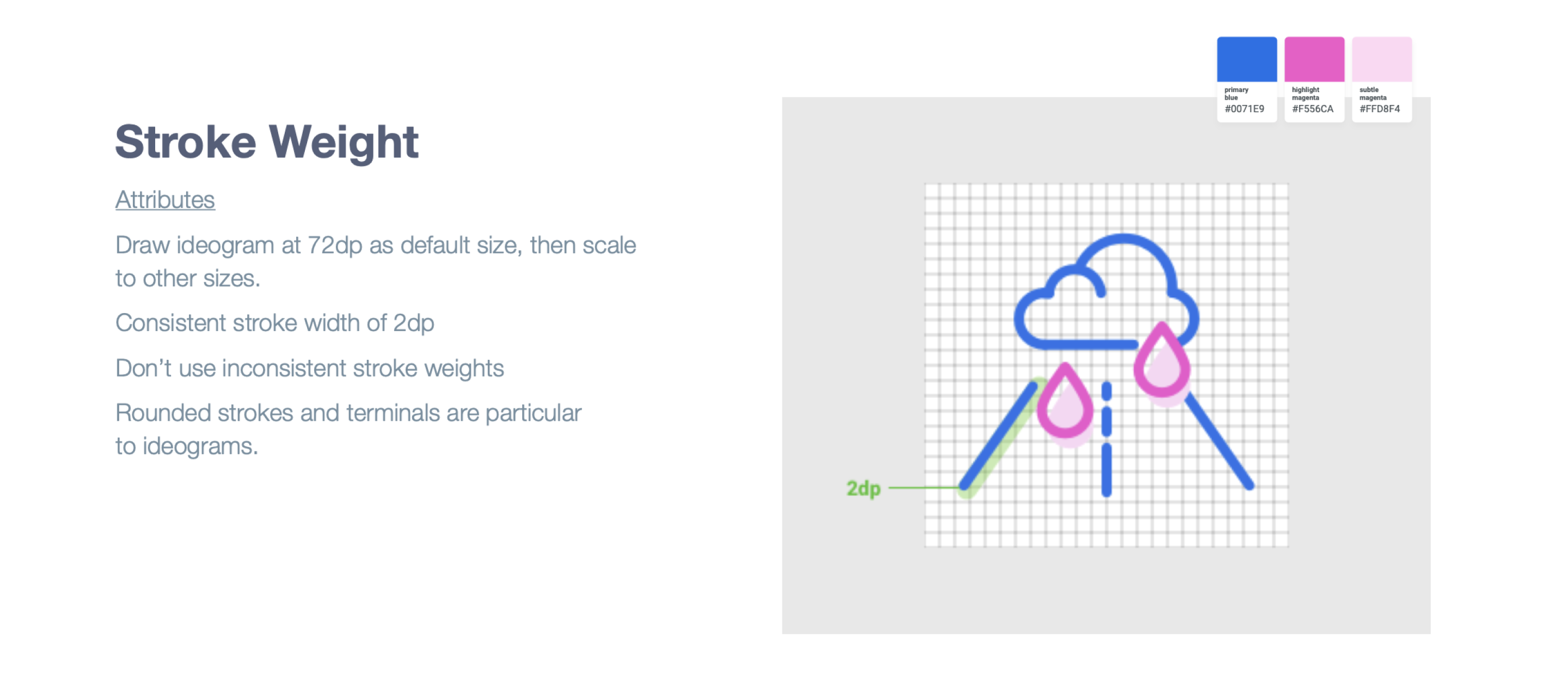
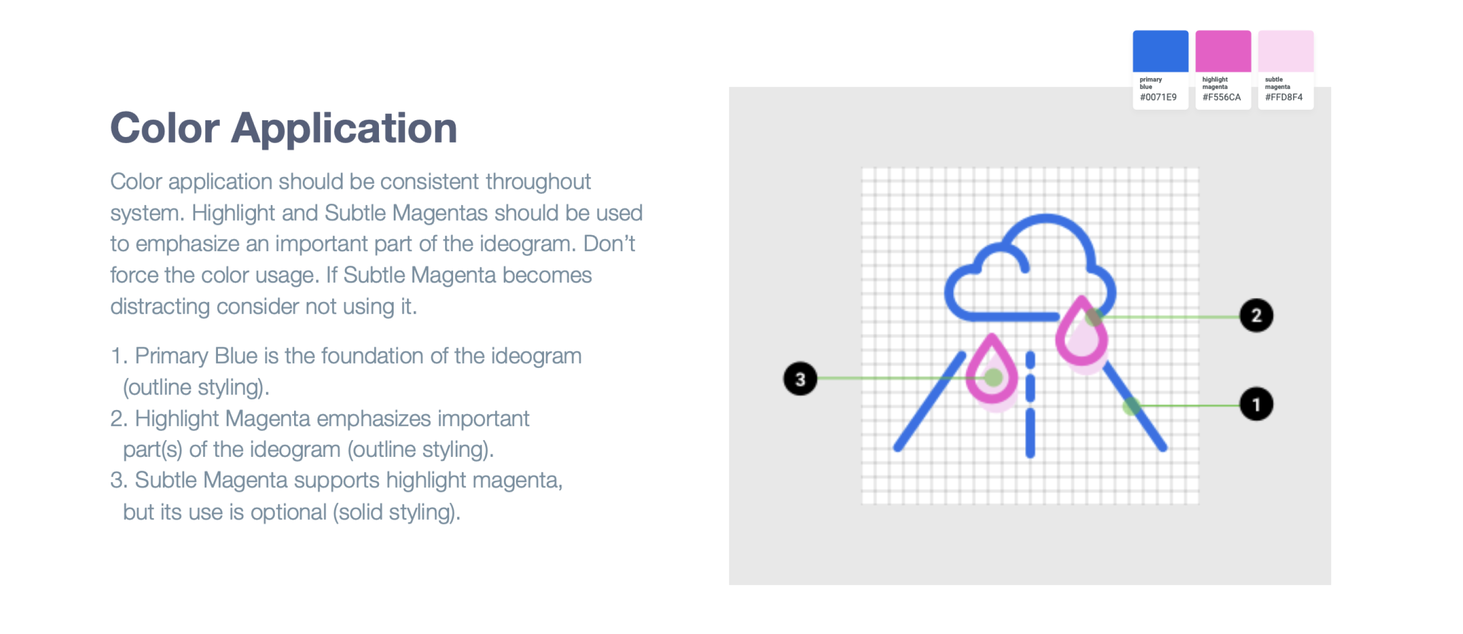
Ideograms by definition live somewhere in between system icons and illustrations. These elements can be sued to add an additional layer of meaning like communicate a concept.
When to use
Ideograms are used in very limited instances. It should bring delight and provide a bit of a narrative. It should not be overused as ideograms have heavier visual weight and using outlines treatment.
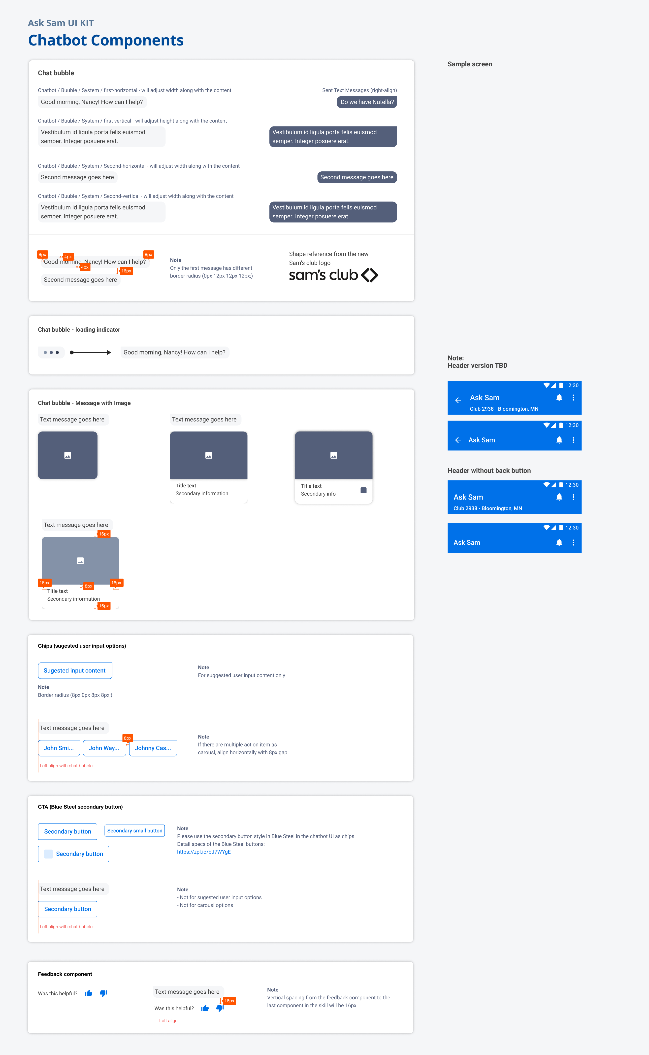
Chatbot UI